13 Cities That Will Pay You To Move There
The physical act of moving is often a hassle. But starting over somewhere fresh and new can be...
By Jennifer Ott, Houzz
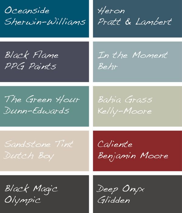
Pantone Color Institute recently declared Ultra Violet its 2018 Color of the Year, but many of you were dubious about the choice, at least when it comes to decorating your home. Those not crazy about Ultra Violet will be glad to know that paint manufacturers have also been rolling out their selections for 2018’s paint color of the year, and these hues tend to be more decorating-friendly. This year’s crop offers a diverse mix of lights, brights, darks and neutrals, so perhaps you’ll find a hue you would be happy to take home.
 Jennifer Ott Design, original photo on Houzz
In general we seem to be moving away from the everything-in-white trend and toward moodier, more introspective hues. Shades of black are in, as are watery blue-greens. I was expecting to see hotter hues dominating the field this year, but the only warm contenders are a bold red from Benjamin Moore and a soft tan from Dutch Boy.
We’ve gathered together examples of each color to help you envision how they might look in a room, should you see something you like.
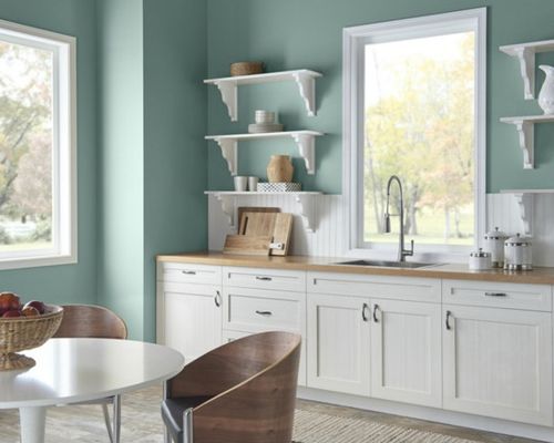
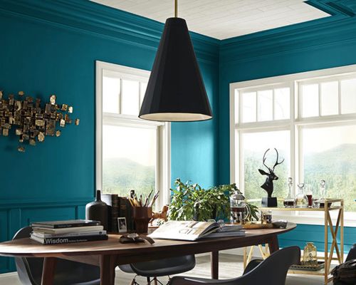 Oceanside - Sherwin-Williams, original photo on Houzz
1. Among my favorite picks for 2018 paint color of the year is Oceanside from Sherwin-Williams, shown above. It’s a rich blue-green hybrid that works well in any style of room, from traditional to contemporary.
And, for lovers of white, because it’s a rather deep, dark hue, I think it needs a good bit of white or other light contrast to help keep it from feeling too somber.
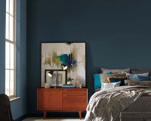 Heron - Pratt & Lambert, original photo on Houzz
2. Heron from Pratt & Lambert is another deep, saturated hue, this one with more blue than green.
I think this is a terrific color in a bedroom, where a cool, calm, soothing vibe is usually desirable. Because it’s a rather dark shade it’s also a good candidate for painting on just one or two walls.
 PPG Paints, original photo on Houzz
3. PPG Paints’ choice, Black Flame, is one of those colors that’s difficult to describe. It’s a navy-purple-black hybrid that will seem to transform during different times of the day in the changing light.
This is a dramatic choice, one that’s best reserved for areas of the home where you want a strong visual impact, such as a background wall for artwork or as a headboard accent wall in a bedroom.
 In the Moment - Behr, original photo on Houzz
4. Behr goes light and breezy this year with their selection of In the Moment. This is a terrific option for those who favor softer hues. I think it would look fantastic in a kitchen or living room. And, because it’s a relatively light color, it works well in spaces that don’t receive adequate natural light.
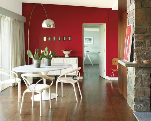 Benjamin Moore, original photo on Houzz
5. In my work as an architectural color consultant I almost always present an option that involves Caliente, Benjamin Moore’s pick for color of the year, shown above.
It’s the perfect shade of deep red, neither too orange nor too purple. It’s just right for a dining room, front door or accent wall in a room that gets plenty of light.
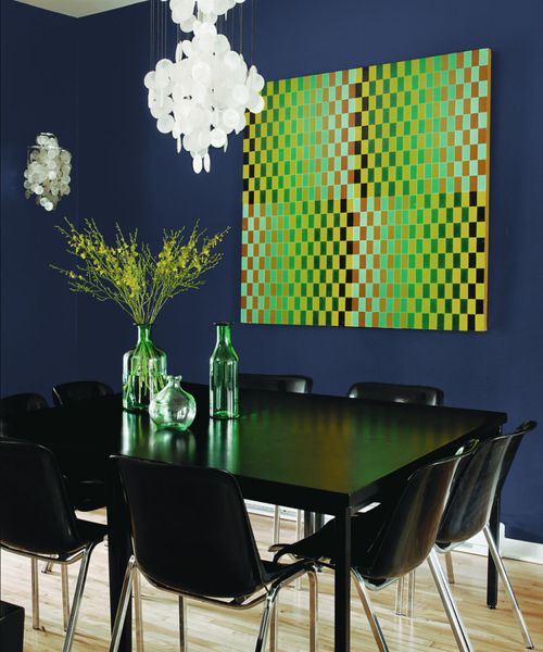
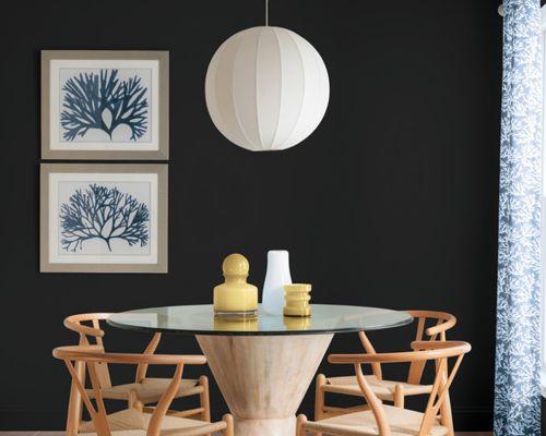 Glidden, original photo on Houzz
<b>6.</b> For those looking to go to the dark side, Glidden’s selection, Deep Onyx, is an almost black that packs a punch. Use it sparingly in spaces that don’t get much natural light. It’s super chic in this dining space.
If you want to use this for an accent wall, think about adding artwork or other decorative elements to the wall to break up the expanse of black. It will look elegant and dramatic without being too heavy.
<b>Related Links:</b>
Try a Deep Blue Hue in the Bedroom
Go Bold With a Red Front Door
Offset Black Paint With Colorful Wall Art